Wednesday, 1 February 2012

My Final Front Cover...

My inspiration came from the Q magazine, I took the idea of my 'Xmas Awards' callout for the Paulo Nutini Q magazine, I used the colours that they used in that front cover because it really jumped off the screen and demanded your attention, the callout is a typical convetion of a magazine.

I also took the way that 'Jasper John' is written from the various special editions that Q did for its aniversary. I like as it is written in hand writing it have a quite personal feel, like the artist himself wrote it on the front.

The inspiration to have my image in black and white came from the Q magazine front cover on Paul McCartney, I like the black and white look as it is very sophisticated and gives a fresh look which I feel my target audience would enjoy.

I used a border around my magazine to make it look more intresting also as a header and footer I added a tagline 'The UK's Best Music Mag' by using 'Mag' instead of magazine I have made my magazine appeal to my audience more as I have used up-to-date slang, and my target audience would talk using words like this, I also did this again by using 'tunes' instead of songs to make it more appealing to the target age group.

My 'Xmas Award' I backed on the two black and white callouts to run with the theme of back and white in my image it gives off quite a bold statement which is the theme I was going for.
I have also place a barcode on my magazine as a typical convention of a magazine, I also added and website, issue number, price and date, I have seen this on every proffesional magazine, and I want mine to be proffesional.

I have noticed through my research that a magzine will use three main colours (exculding their brand colour) in a magazine front cover, this is very widely used so I decide to encorporate it in my magazine, my three colours were red, black and white. In the 'talks about in his new abum' I used a grey font backed on black, this is because this wasn't the bit of the magazine I wanted to catch their eye with.

I also put 'This Years Top Tunes' in red and black because it tands out also red gives the theme of expencive, elegant and royal, I chose red because of this because I would want my magazine o be something special and rare.

I have used ID backed on a blue background in white as my masthead as I believe it would be appealing to my target audience, about 90% of the 17-25 year old I have asked about masteheads said that they prefer the current mastehead that I have on my magazine and that they think the masthead that goes across the entire page is bland, boring and to common and they want to stand out from the crowd.

Double Page Spread Research

Image: I like how the image is very casual and laid back this suggests the theme of the article and how it is going to be written, I like how the picture is using direct address this draws the audience in and makes it feel more personal. It is also quite simple but it still gives a bold statement.I also lie that there is a polirod photo with in the article, this gives a with in the action moment, how it really happens.
Font/Size: I like how the first letter of the article is bigger than the rest, I plan to include this in my own article. I also like how there is a quote on the photograph, giving you a snap shot into the article.


In this magazine I like how the image is using direct address but I also like how it has been edited, and isn't in normal colours, I also like how the artists name is written in the top corner. My favorite bit of the whole double page spread is the L on the background of the writting.

I like the simplicity of this article how the main colours are red, white, blue and gray, this makes the article look very proffesional and sophisticated, this is how I want my article to look and how I want it to feel.


I don't really like this final double page spread I like this is because a lot of the writing is in red, but I do like how there is a magazine footer telling you what page, what magazine it is and what type of article you are looking at. This is what I plan to use in my magazine.
I also don't like how the page look wonky, I think this makes it look less proffesional.

Tuesday, 31 January 2012

More Contents Progress...


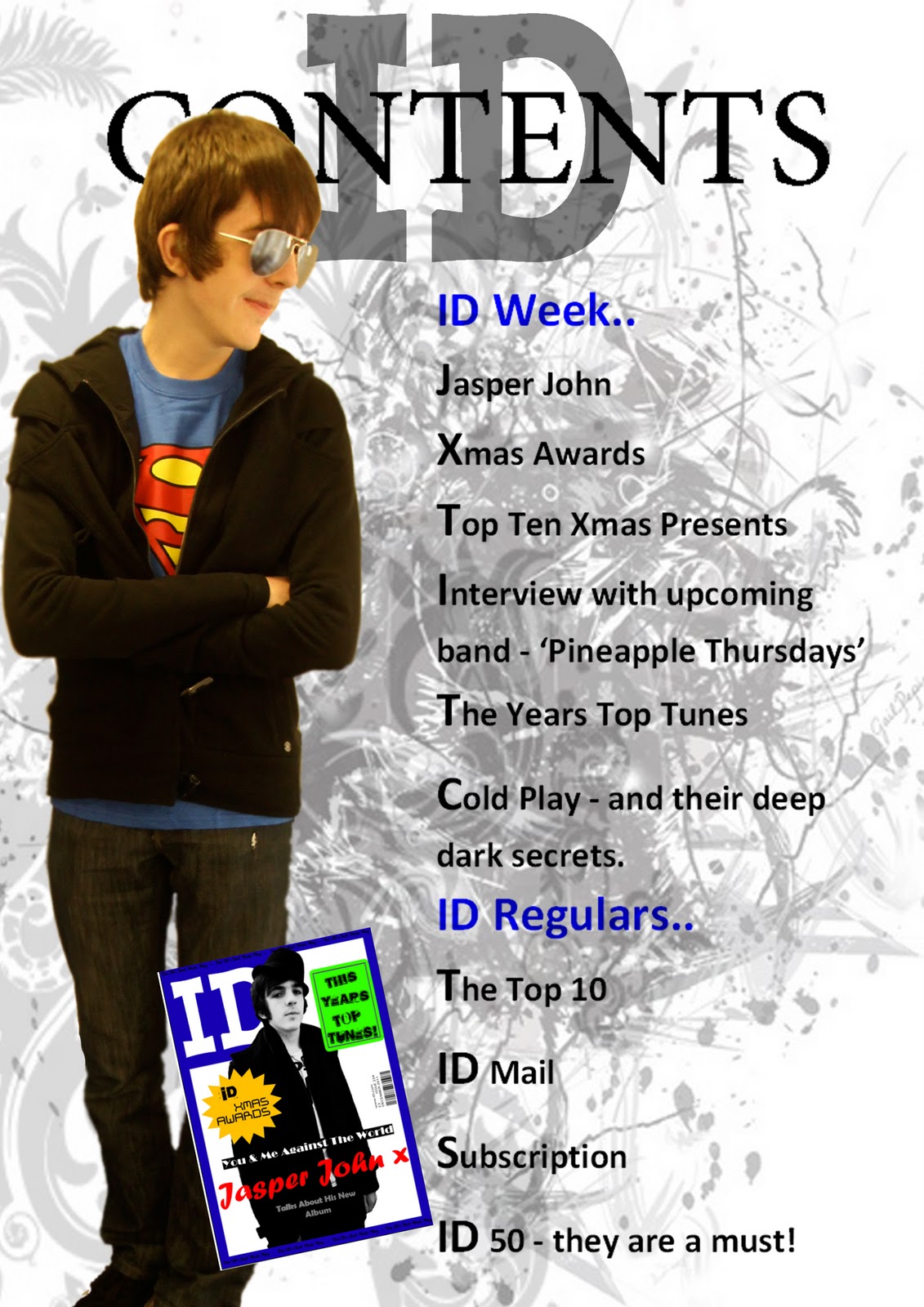
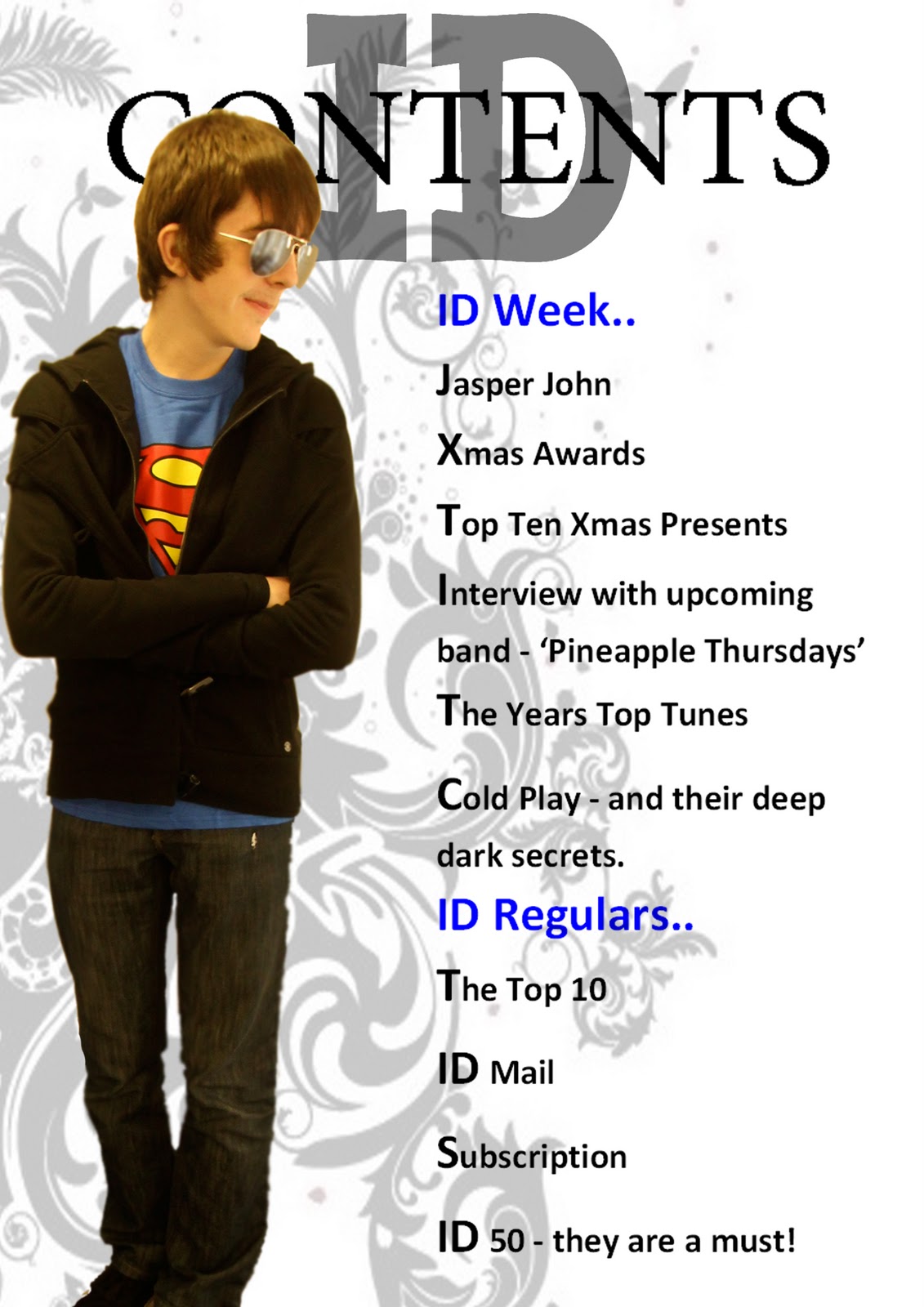
Progress of Contents Page


This is the progress of my contents page....


Final Drafts of Front Cover

These are the final drafts of my front cover, I have decided to change the primary colours of my front cover so it looks more sophisticated and less childish...


This is my final draft,
I am going to change the colour scheme because it looks like the colours you see on a child's magazine.

Saturday, 14 January 2012

Front Cover Progress...

This is the steps I made to make my front cover I decided that if I wanted to target a sophisticated, classy audience then I would need to change the front cover I had all ready made, my magazine is strongly linked to the Q magazine and if this magazine were to go into production then there may be a partnership, and iD would take the place of Q's young brother.

This is the original picture I started with, I used tools like:

Blur
The Magic Wand
The Quick Selection Tool
The Rubber
Spot Healing Tool

To edited the image I changed:

The brightness and contrast
The hue and saturation
I changed it into black and white
I used the curves tool
I also put some different filters on it to make it look bold and sophisticated


This is the image that I ended up with as the main image in my magazine.


I have added some of the basic conventions of a magazine for example I have put in the barcode with the issue number, price, month and the website.

I have put the masthead in and header and footer border in blue to encourage a house style for the magazine.

I have also put in the main story, the idea to have the writing of the artist's name came from the Q magazine featuring Paulo Nutini on the from cover. I liked that from cover because I found it quite personal and the idea of having the font in handwriting it gave of a diary feel suggesting that the magazine hold some personal gossip and also the absolute truth.


In this draft I noticed that I should put in a tagline to the magazine so I used 'The UK's Best Music Mag". By using terms like 'Mag' in my magazine gives my audience something to associate and identify with because that it the sort of language that my audience would use.

I have also changed the colour of my magazine cover line, so that it would stand out more.


I have now added a callout to my magazine to make it more professional and add stories to make the reader interested in what is inside.

By using a callout it gives my front cover a fresh, crispy look. I also make the magazine stand out with bright colours and interesting shapes.


In this draft I added more cover lines to my magazine, the font looks worn away, that it is ending, I have chosen this font because it suggest that something is coming to a close and as my magazine is a December Issue that idea ties in nicely as the year is coming to a close.


I decided that my cover line did not stand out enough and didn't jump of the page and grab the readers attention.

In this issue I also changed the main cover line again to a golden colour box with what looks like black calligraphy, this has the connotations of rich, powerful and domineering and this is what my target audience aspire to be like.

The inspiration of this came from a Q magazine featuring Paul McCartney.


In this draft I decided to change the main cover line again because I wasn't sure whether the main story stood out enough, I have also changed the font to a more laid back type of handwriting because I don't know if the previous cover line was to formal and uptight, and that is not how I would want my reader feeling if they were to read my magazine.


The next to images are my possible final magazine cover with all the cover lines on:


Tuesday, 3 January 2012

Base of Contents


This is a mock up of what my contents page will look like I have taken inspiration from Q magazines contents page.


This is the contents page which gave me inspiration.

I like it because it has a simple but sophisticated layout.

I plan to also have a advertisment forsubscription of he magazine, this is seen a lot in music magazines.


I like this magazine contents as it is very striking and stands out, this is because of the colours.

All though I like this magazine it is clear that it is a student magazine and this is not what I am looking for, I want my magazine to look of a professional standard.


In this magazine I like how the picture relate to the text on the left, I also like how they have split it into sections like regular and exclusive.


I like this magazine because it has interesting graphics at the sides of the page and also I like how the stories are separated into sub headings like; cover story,features, people, life style ect.

A negative about this contents page is that it looks like a students also apart from the interesting swirls at the side there isn't much colour making it look a little dull.


The last one is my favortie it is very eye catching the main reason is because it looks proffesional also it has some great graphics. It also looks very modern.

I also like the very obvious and dominant colour scheme, I play to use a colour scheme through out my magazine.