Friday, 19 April 2013

Evaulation..


Audience Feedback:
I have had a large amount of audience feedback from both my target audience and my family; I have found it incredibly helpful as I have been able to alter my products accordingly.
As early research I showed my script and storyboards to a few peers and my family – the response was the same; the jump cuts between the protagonists mind and his reality did not make sense and as a result I decided to remove this from the script. Meaning that it is much more easily understood by my audience which is obviously very important.
I showed both my film poster drafts and my review pages to a peer throughout the course and they helped me to improve many aspects of my texts that I simple did not noticed when I looked at it myself.
I also found audience feedback in terms of understanding the symbolism that I was representing through my text  - I used other people to see if they understood what I was trying to represent meaning that the symbolism was clear not only to me but my audience too.
A few examples of what I have said above is that someone who watched my video said that they liked how I had separated the two different areas of the protagonist’s real life and his thoughts by converting sections of my video into black and white – they also thought this was effective as they felt that this reflected the mood of the video very well and communicated how hopeless someone in the protagonist position would feel this made me feel as I had achieved something as this was my intended meaning.
Another viewer of my video commented on how the glasses were the only difference between the bully and the victim which in there opinion make the audience look down on the bully for having such a petty excuse for bullying someone, my audience member felt that this discouraged this type of behaviour.
When I asked several members how they felt when the were watching the video they responded that it provoked many emotions put particularly sympathy when the protagonist was being targeted but also hope in the last scene – I was slightly conscious that the sound that I had used was a bit sketchy and very noticeable but I was thankful to find from my audience that they hadn’t noticed it.
The overall feedback has been very useful and helpful – following the feedback from my audience at different states I have tried to alter my video to improve the highlighted areas overall making my video much stronger and better quality.


Final Video...


Above I have posted my final edit of 'Don't Judge a Boy By His Glasses" I am very proud of it as I have put a lot of time and effort into creating it; there are still some little flaws with it mostly concerning the sound but I feel that overall  it is a good quality and successful piece. I have got a lot of positive feed back and provoked discussion following my short film which tells me that it has been effective in communicating the ideologies I wanted it to and that it is worth watching.

The sound in my final scene is a little sketchy but I have edited it and although it is not perfect I believe that it is an improvement and is no longer that noticeable unless you are listening for it.

Although the sound is flawed in my final scene it is probably the one I am most proud of due to the camera movement that I have used in it and what I have done with it in the editing process. In my planning process I knew I would have some trouble with making the final scene different from the rest so I spent a lot of time looking for a video filter in the editing process – using ‘vintagette’ has made it contrast with the rest of the piece which is in normal colour or black and white.

I feel that because I converted many of the scenes to black and white this gives of the idea of a dream world and the audience can distinguish between my protagonist’s thoughts and reality but also I believe that it communicates the emotions of sadness and hopelessness throughout the piece. My decision to convert these parts into black and white has also meant that my film has a much more serious and respected message.

Thursday, 18 April 2013

Final Film Article...


This is my final review page as part of my ancillary task. Personally I am very proud of this piece of work and I have receive a large number of compliment about it in regards to it looking very professional.

I believe that my film review page is up to the standards of the professional review pages found in Total Film.

I have included a number of typical codes and conventions in my review page from Total Film such as a basic information box, a star rating, the page number, website, magazine name, publish date and a distinguishable header.

I have also used a consistant house style throughout the review page and emulated the style from total film. I stuck to a simple, basic but effective colour scheme of red, black and white making my review page look sophisticated, crisp and fresh. Looking through a number of Total Film reviews I recognised that at the start of the article the first letter of the first word is always large than the rest of the article and white backed on read therefore in keeping with the rest of my article I emulated this too.

I changed the image of my review page as I found that the original image that I used was although very representative of the film was very disconnected and inpersonal as there was not really a human element to it and because my film is directly related to emotions and I wanted the audience to connect with my character I changed it to a more personal image.

Whilst writing my article I tried to write in the style of Total Film reviewers - although this look several drafts I believe that in the end I grasped it and pulled it off successfully. I found that Total Film reviews would be very opinionated and analytic of the film so therefore this is how I wrote.

Tuesday, 16 April 2013

Edit 3...


This is my third edit of "Don't Judge a Boy By His Glasses" again there are some obvious problems with the above video but it has been improved a lot since the last edit. These are the issues I look to resolve for the next video.

  • The bedroom scene is too quiet
  • The hit scene need to be optimised - perhaps slow motion so it stands out?
  • When the actor leaves the hall the sound is very low, therefore I need to turn up the volume on this part.
  • The locker scene needs to be converted into black and white and more varitey shots needs to be used
  • The volume in the locker scene needs to be reduced as it is louder than the rest of the film
  • The locker scene needs to be shortened as it is not as fast paced as the rest of the film
  • In the 'pull chair' scene  the actor looks that the camera.. this needs to be removed - shorten clip
  • Music in the  transformation scene needs to be imported and matched up
  • Music needs to be matched up throughout the film

Monday, 8 April 2013

Film Article Progress...


Above is the progression of my film article; I emulated the layout of Total Film and used it as the magazine that it would be included it. I used Total Films house style by using the typical colours (red, white and black) and  the same fonts. I feel in terms of visuals I haven't developed it much as emulated Total Films review pages exactly however in my third draft I inserted a star rating and 'out now' date and in my final draft I included a larger letter for the first word backed on red as this is something I recognised from a number of Total Film pages.

In most of the review pages I have looked at they include an image which is typically a still from the film - therefore I stuck to this convention and included it in my work too. From my image it is not clear what the film is about and what sort of tone and ideologies it communicates - this is the main criticism of my review page and I plan to change this in my final draft so my audience can relate to it more and get more information about the film but just looking at it.

I have included a basic information section in my review page as this is a typical convention of a review page. Overall I believe that my final draft it a good quality for a review page and now all I need to do it fine tune it for my final review page.

Sunday, 31 March 2013

Don't Judge A Boy By His Glasses Film Poster..


This is my final film poster - I am rather pleased with it as it looked very professional and very similar to the Scarface film poster that I was emulating.

I have included all the typical conventiuons of a film poster:
    • Title
    • Director and starring information
    • Release date
    • Copyright information
    • The film's website
    • The age classification
    • Production and basic role information
    • A main image
This all leads to make film poster looking very professional.

I created my entire poster in gray-scale as it communicates the connoations and agenda of the film. It tell the audience that the film brings to light and tackles a serious subject. This film poster would appeal to film critics and independant audiences because it is artisic and carries symbolic messages within it.

I have edited the image so it is slightly cartoonish as is makes the poster much more ambiguious and means more people would be able to relate to the situation and character. The cartoonish image also highlights the glasses that my protagonist is wearing obviously an important propp in my film and his costume and other problems clearly highlight that the film is set in a school.

Final Progress On My Film Poster..

Below are the final amendments on my film poster; the next blog poster will be of my final film poster.


The image is a huge improvement on my previous one as it is beginning to look much more cartoon like - the way I wanted it, it contrasts with the background on the black and the white. In my next progression I will alter the font that I have used as the current one is not very professional because it is very basic.

I want my new font to look more professional but I want it to communicate the same ideologies and agendas about my short film.


In this draft I have altered the font and it makes it look much more professional. I have also started adding in other conventions of film posters in this draft I have inserted the release date of the film I have put the release date in the same font and close to the same size as my font because it is just as important because the audience would need to know when they can watch it.


In the draft below I have included the production details of my film which are typically included in a film poster. I researched into what is include in the small print at the bottom of most film posters and I have included this in mine. I have also included the age certificate for my film - this relates to my target audience as it does not exclude their age group.


The poster below shows a vast improvement on the previous draft, I have altered the font of my production details to make it look more typical of a film poster. I have continued to use this font throughout the rest of my film poster (excluding the title and release date) as a kind of house style. I have included typical conventions such as who directed and a stars in the film above the title as a USP, copyright information and the film website.


I Got A Bit Stuck..

When trying to emulate the Scarface poster I had a bit of trouble making it look professional so I opened a new file and started playing around with a new image. These were my results:


If I was to develop on of the above mock-ups to create my real poster it would probably be a development of the second one, however I have managed to alter the more original idea and will be using that as my final film poster.

Sunday, 3 March 2013

Edit Two


Above is the second edit of our film, unfortunately the first edit won't be uploaded as there was formatting problems.

There are some obvious and glaring issues in the video, however, overall it is an improvement on the first edit. In this edit I converted the possible thoughts of Dudley into black and white so the fact that the points where he is getting bullied are just thoughts is much more obvious and easier for the audience to understand. Below I list my criticisms and improvements that need to be made to this edit:


  • Pan in bedroom is too quite
  • Is the opening sequence to short?
  • NEEDS MUSIC
  • Title sequence is too long in comparison with opening sequence - perhaps overlay title on action?
  • Issue with how actor is holding books at 0:30
  • Hit in hallway is not clear
  • Sound in hallway scene changes to much
  • The volume alters to much throughout
  • Changes between bully scenes need to make it more clear that there is a change is scene need a way to make the change clearer
  • Sound = REALLY BIG ISSUE
  • Need a better transition between last bully scene and the 'transformation' AND needs different music than previous
  • Hold end shot for longer
  • Could the film use a shot of people walking around the school - panning?
  • Insert end credits
***

Main changes needed:
  • Sort out diegetic sound
  • Find music to include
  • Sharpen up cut lengths - longer or shorter
  • Include / add credits

Backbone Of My Film Article...


 I started creating my article by including the basic conventions such as title, photograph, basic information and header and footer. Here is my progress:


For my review I have followed conventions set down by the successful film magazine 'Total Film'. I emulated this magazine style as it is sucessful and it appeals to my target audience. I have emulated the housestyle, the colour scheme, the font type and size, the column layout, the borders and information box.

Mock Up For Film Article...

I sent some time making a mock-up for the layout of my film article. This is what I came up with:


I have decided to emulate the film reviews shown in Total Film and I will copy the house style of the magazine so my article looks the most professional that it can.

At the bottom of the magazine I will add other typical conventions such as, page number, magazine, date and website.

Wednesday, 30 January 2013

Third Draft of My Film Poster...

This is my third draft of my film poster. I have decided that this is what I will develop to obtain my final film poster. What I like about this poster is that the black and white makes it sophisticated and profesional whilst the font I have used make it seem related to young people and schools. I believe that this poster would appeal to my target audience.
In my next draft I plan to include a webpage and basic film information typically found on a film poster advertising the release of a film.

Second Draft of my Film Poster...

This is my second attempt at a film poster for my short film, I am much more pleased with the result. Especially with my image of the victim.

I need to add more typical film poster conventions to my film poster and I also feel it need to stand out more which is another improvement I hope to make in my next draft.

I will try by changing my background colour from white to black.

First Draft of Film Poster...


In this film poster I emulate a lot of different features that I had seen on my film poster research. However, it has not turned out as I would have hoped due to the split screen of black and white which makes it look like a circus.

I have decided to change my idea so that the whole human subject is the same colour and not split. However, I have decided to continue to use black and white as it conveys the meaning and agendas that are seen in the film.

In addition in the film I plan to convert parts into black and white as it makes it seem important and I believe this would be professional to continue through out my ancillary tasks especially my film poster as it gives a sense of house style that I have seen in most successful media products.

Even though I plan not to use this as a film poster I really like the face that the main image only has the basic outline of a boy meaning that this film or person is generic and could apply to anyone.

Tuesday, 29 January 2013

All Filming Is Done...

We have finished all our filming and have recently started editing. The first draft should be ready soon!


Final Storyboard

Here is the PDF of the final storyboard.

Film Poster Ideas...

I have had a few ideas for creating my film poster. I am planning for it to be simple and attention grabbing. These are some of the ideas I am hoping to emulate:


I have decided that I would like to make a film poster in a silhouette format as this conveys a lot of ideologies about the short film and an audience can denote the images and text to realise the dominant/preferred meaning of my text.

Rough Storyboard...

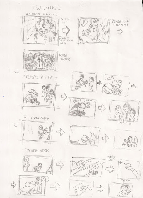
This is the back bones of the storyboard that we created before half term to line the story. I then write it up adding some flesh to the writing. We are now doing the more professional and detailed scripts for our film.


Thursday, 10 January 2013

Pinny Grylls


After looking at many short films I have found this one most inspiring, I especially admire Pinny Grylls work because it is not a typical short film. The ideas are very unique and induvidual, they also communicate meaning.

Pinny Grylls is a award-winning british film maker, she co-founded Invisible Films and the following year founded the Bird Eye View Film Festival which has shown films of emerging female filmmakers throughout the country. Peter and Ben was her second short film documentry.

Shooting Film..

Over the past term we have been filming the school scenes in lunch times as this was they only time our actors could do. Our last set shoot day is tomorrow lunch time where we plan to shoot the transformation scene. Then it is on to the editing. Exciting!!