This is the steps I made to make my front cover I decided that if I wanted to target a sophisticated, classy audience then I would need to change the front cover I had all ready made, my magazine is strongly linked to the Q magazine and if this magazine were to go into production then there may be a partnership, and iD would take the place of Q's young brother.

This is the original picture I started with, I used tools like:
Blur
The Magic Wand
The Quick Selection Tool
The Rubber
Spot Healing Tool
To edited the image I changed:
The brightness and contrast
The hue and saturation
I changed it into black and white
I used the curves tool
I also put some different filters on it to make it look bold and sophisticated
This is the image that I ended up with as the main image in my magazine.

I have added some of the basic conventions of a magazine for example I have put in the barcode with the issue number, price, month and the website.
I have put the masthead in and header and footer border in blue to encourage a house style for the magazine.
I have also put in the main story, the idea to have the writing of the artist's name came from the Q magazine featuring Paulo Nutini on the from cover. I liked that from cover because I found it quite personal and the idea of having the font in handwriting it gave of a diary feel suggesting that the magazine hold some personal gossip and also the absolute truth.

In this draft I noticed that I should put in a tagline to the magazine so I used 'The UK's Best Music Mag". By using terms like 'Mag' in my magazine gives my audience something to associate and identify with because that it the sort of language that my audience would use.
I have also changed the colour of my magazine cover line, so that it would stand out more.

I have now added a callout to my magazine to make it more professional and add stories to make the reader interested in what is inside.
By using a callout it gives my front cover a fresh, crispy look. I also make the magazine stand out with bright colours and interesting shapes.

In this draft I added more cover lines to my magazine, the font looks worn away, that it is ending, I have chosen this font because it suggest that something is coming to a close and as my magazine is a December Issue that idea ties in nicely as the year is coming to a close.

I decided that my cover line did not stand out enough and didn't jump of the page and grab the readers attention.
In this issue I also changed the main cover line again to a golden colour box with what looks like black calligraphy, this has the connotations of rich, powerful and domineering and this is what my target audience aspire to be like.
The inspiration of this came from a Q magazine featuring Paul McCartney.
In this draft I decided to change the main cover line again because I wasn't sure whether the main story stood out enough, I have also changed the font to a more laid back type of handwriting because I don't know if the previous cover line was to formal and uptight, and that is not how I would want my reader feeling if they were to read my magazine.
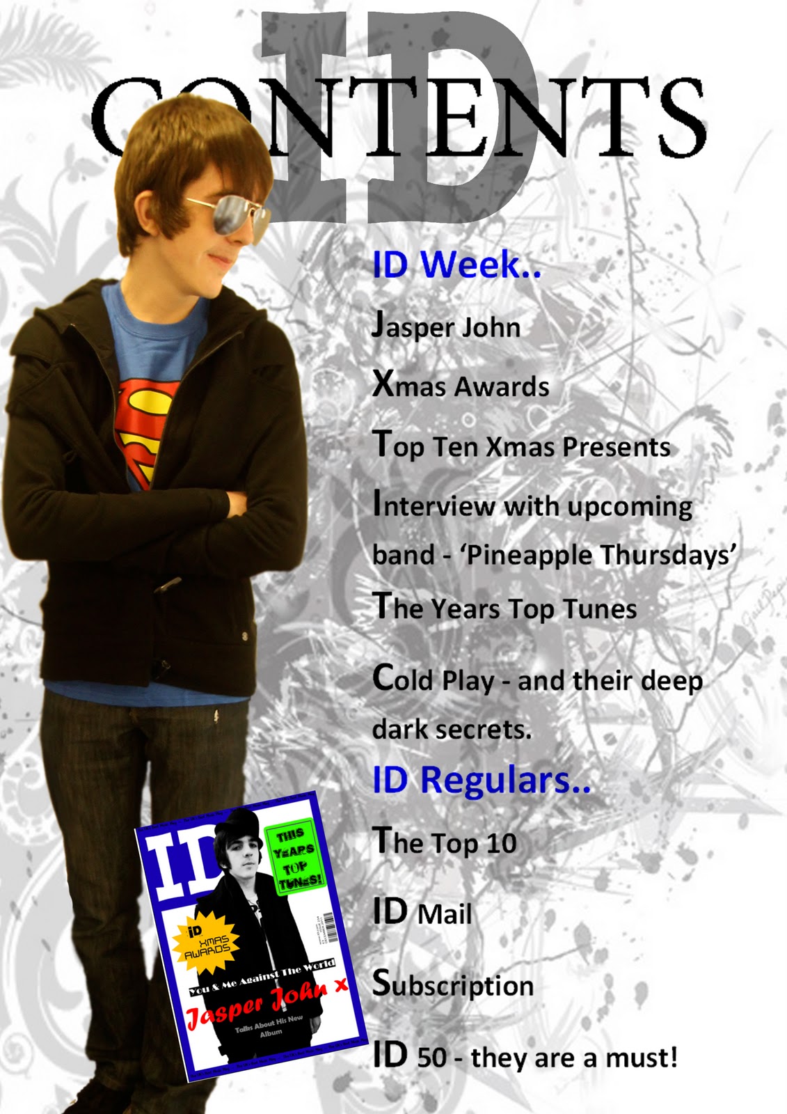
The next to images are my possible final magazine cover with all the cover lines on:


 This is the original picture I started with, I used tools like: