Friday 26 October 2012

Script & Storyboard Information...

This is some research I did into scripts and storyboards. This will definitely lead to improvements in my work.

Example of a six shot storyboard

What is a storyboard?
Once a concept or script is written for a film or animation, the next step is to make a storyboard. A storyboard visually tells the story of an animation panel by panel, kind of like a comic book.
Your storyboard will should convey some of the following information:
  • What charaters are in the frame, and how are they moving?
  • What are the characters saying to each other, if anything?
  • How much time has passed between the last frame of the storyboard and the current one?
  • Where the "camera" is in the scene? Close or far away? Is the camera moving?
Why make a storyboard?
Creating a storyboard will help you plan your animation out shot by shot. You can make changes to your storyboard before you start animating, instead of changing your mind later. You will also be able to talk about your animation and show your storyboard to other people to get feedback on your ideas.


How do I make a storyboard?
Most commonly, storyboards are drawn in pen or pencil. If you don't like to draw you can also take photos, cut out pictures from magazines, or use a computer to make your storyboards. Keep in mind that your drawings don't have to be fancy! In fact, you want to spend just a few minutes drawing each frame. Use basic shapes, stick figures, and simple backgrounds. If you draw your storyboard frames on index cards, you can rearrange them to move parts of the the story around.

Storyboard Language
CLOSE-UP SHOT:   A close range of distance between the camera and the subject.
DISSOVLE: A transition between two shots, where one shot fades away and simultaneously another shot fades in.
FADE - A transition from a shot to black where the image gradually becomes darker is a Fade Out; or from black where the image gradually becomes brighter is a Fade In.
HIGH CAMERA ANGLE:  A camera angle which looks down on its subject making it look small, weak or unimportant.
JUMP CUT: A rapid, jerky transition from one frame to the next, either disrupting the flow of time or movement within a scene or making an abrupt transition from one scene to another.
LEVEL CAMERA ANGLE:  A camera angle which is even with the subject; it may be used as a neutral shot.
LONG SHOT:  A long range of distance between the camera and the subject, often providing a broader range of the setting.
LOW CAMERA ANGLE:  A camera angle which looks up at its subject; it makes the subject seem important and powerful.
PAN:  A steady, sweeping movement from one point in a scene to another.
POV (point of view shot): A shot which is understood to be seen from the point of view of a character within the scene.
REACTION SHOT- 1.: A shot of someone looking off screen. 2.: A reaction shot can also be a shot of someone in a conversation where they are not given a line of dialogue but are just listening to the other person speak.
TILT:  Using a camera on a tripod, the camera moves up or down to follow the action.
ZOOM:  Use of the camera lens to move closely towards the subject.


Storyboard Examples
From the Jane Animation Project - Hunting Sequence

Jane Animation Project Hunting Sequence Storyboard
 
 
A simple storyboard made using stick figures
 
 
Stick figure storyboard example


A storyboard for a TV Western

TV Western storyboard example

Saturday 20 October 2012

My Target Audience..

My target audience profile:

  • Gender: Both
  • Age: 13-17
  • School age
  • Has some link to bullying and some experience of it
  • Typically watch niche and independant films
  • Vast intrest in many types of music
  • Typically read film and/or music magazine
My film could be used in a PHSE lesson or as an aid in a bullying campagin so even though my specific audience is listed above my film could appeal to a large audience but still prodominately secondary school aged people.

Friday 19 October 2012

Final Film Idea...

This is a powerpoint I made about our final idea for our short film.

Bullying Films I Have Seen...

As I have decided to make a short film involving bullying I decided to watch a couple videos about bullying and decide what I want to do with mine.


These are two short films on bullying that I enjoyed watching, in most bullying films the escape is suicide, however I have decided that I want to challenge this convention. In Sticks & Stones I really like the voice over and have decided that I would like to include this in mine. I have also decided that I would like to shoot my film in the shot style like both of these films.

Thursday 18 October 2012

Refined Film Idea...

This is one of my film ideas I had in more detail, I have decided that my film will be along this idea...

Short Film Ideas...

These are some of the short film ideas we had...

What Next...

I have decided that I want to make a short film for my course work. I will make a short film, review of the short film and a film poster.

Analysis of Film Reviews...


There are all the typical conventions included in this review the title of the film is in bold, so that it stand out and captures the views attention and there is also a synopsis of the plot. The main article starts and stands out and the beginning because the first letter is bigger than the rest. There is also extra information about the article and the film to set the review in context. There is a page number and magazine name.
There is a quote from the actor this makes the review feel more personal and appealing to the audience it is also in a different font attracting the audience to read the quote. The colour scheme is blue, greys and black this is so the audience is not distracted from the main selling point, Will Smith. There is also the use of a plug this give basic information and encourages the audience to read on.
There are two images, of it the main and the other secondary the secondary is a shot from the film, this is standard and gives the audience an incite into the plot. However the main image is actually on set and we can see behind the scene and the professionalism. This sells the film as the audience feels as if they have exclusive access and then feel a responsibility to see it.

This is another example of a two page review and the conventions have remained the same, there are three columns of text which have been split up by tables and callout to make it easier on the eye and less daunting to read. The main colour scheme is white, black and red with a little yellow this is because they want the text to attract some attention but the image is the main selling point as it is part of a number of film so Jack Sparrow captures the attention of the audience. The review has also included a star rating this helps the audience as it gives them an instant review so they can then deduce quickly whether they want to read that review.
They also include a 'see this if you liked..' this is useful and could be a selling point of the magazine as it is unique. The main image gives an insight into the film. The tone of the text is quite informal because the writer of the text wants to appeal to the audience and reader and they also want them to enjoy reading the text. The audience is people in their late teens and twenties so the magazine has written this review casually.

Avatar is a magazine which contrasts with most reviews I have seen, most of the articles I have seen are quite simple and plain so you concentrate on the reviews whereas here you concentrate on the visual aspects.
Again like the rest the article is over a double page spread and has the typical conventions of title, images, fact file, release date, certificate, page numbers and magazine name. It also has a summary of the article above the article. Excluding the pictures the main colour scheme is black, white, orange and some red. This colour scheme attracts a lot of attention as it is very bright and exciting, it also adds cohesion to the page. The colour scheme also does a good job of bring the colour of the images out. There are also a lot of callouts in the text to give the audience instant information.
The secondary image is in the style of a strip of storyboard images, it is a plain view but it is interesting as it is not the typical convention all the images tell the story of what happens in the film, however if you haven't seen the film you wouldn't know this you would just be attracted to the modern looking animation pictures. Avatar uses a lot of modern special effects and CGI and this is reflected in the review as it looks very up to date and modern. The images offer a sense of genre - fantasy and action. The text used is in a consistent font this is not to attract you from the images. The images don't overlap, however, the textboxes do this is a good effect as the layering.

What Are Film Review Pages...

A review is an evaluation of a publication, a product, a service or a company such as a movie (a movie review), video game, musical composition (music review of a composition or recording), book (book review); a piece of hardware like a car, home appliance, or computer; or an event or performance, such as a live music concert, a play, musical theatre show or dance show. In addition to a critical evaluation, the review's author may assign the work a rating to indicate its relative merit. More loosely, an author may review current events, trends, or items in the news.

Typical Conventions of film review pages:

  • Name of Film
  • Release Date
  • Quotes or Reference
  • Summary
  • Plot (but no spoilers)
  • Opinion
  • Characters / Actors
  • Ratings

Other conventions:
  • First letter larger than the rest
  • Images with captions
  • Page numbers
  • Quotes in italics
  • The date

Analysis of Radio Trailers...


The radio trailer has a very distinct target audience this is told by the language such as atmospheric, front and pressure gradients, this make it sound like they understand weather well, and that the are a trusted source. The sound behind the man talking is wind this is very related to the Weather Series and also tells the audience what the specific program will be about without having to listen intensely. It also sounds like old radio trailers and the old BBC program which is appealing and you can identify that it is the BBC straight away. The trailer also uses some puns like 'sweeping into BBC4 in the next few weeks.' this also gives the audience the program and the times; it is also very memorable as you remember the pun.

This radio trailer uses Stephen Fry to attract their audience as he is popular and people want to listen to him, this is an example of star appeal. This radio trailer also uses the typical convention of putting the time and program at the end this is so it sticks in the audiences head.
Both of these trailers are for documentaries, unlike drama the have a very specific audience and they are often more mature than those who watch dramas so there for the trailers are usually more serious.

This is the final trailer that I will be analysing unlike the others it is it is of the Drama, sci-fi drama so there is more of a hook to the audience. It contains most of the typical conventions such as, the time, date, and program it is shown on, quotes from the film, the program sound track and music. It starts of telling us the channel, if the audience like the channel they will me instantly drawn in. After this a extract from the program is played this instantly tell the audience what program it is and even if the audience hasn't heard of it before the quote is blunt, declarative and attention catching the will want to know what Pandorica is and what will happen. At the end of the quote when the women says 'silence will fall' some music starts to build making it more dramatic, after this more extracts come from the trailer it is all very loud and busy this creates tension and interests the audience. The quotes also give away a little of the plot to hook the audience so the watch it to find out the whole story.
The voices are filled with panic and hysteria with the music this make a very dramatic atmosphere which are all female we think damsels in distress, when they say Doctor we instantly identify the show. The last quote is from the cool, collected Doctor this draws in fans and at the end he says 'come on' this is obviously to the villains but it could also be interpreted as to the audience as well, meaning come on and watch it.
Radio can only use sound in trailer so theme need to use a lot of intriguing sounds to hook the audience. It has to be interesting as otherwise people just won't watch it.

What Are Radio Film Trailers?

The codes and conventions I found of radio trailers are as follows:

-Short audio clips from the programme included.

-Occasionally a music bed with music that is relevant to the programme in some way.

-Voice over is used. The voice over has to narrate and briefly outlines what the programme is going to be about. Sometimes there is a slogan used to hold the audiences attention.


-Average length of a radio trailer clip is 40 seconds.

-Mentions what channel it will be broadcasted on and what time.

-Often teases the audience to make them watch it.

-The often creates tension.

Wednesday 17 October 2012

Analysis of Film Posters...

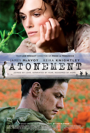
This poster contains all the typical conventions of a film poster; it also contains some extra information like 'Best selling novel' and 'director of Pride and Prejudice'.
 The font of the text gives of a huge clue of the time period in which the film is set and also the type of genre the film is. The tag line is also very important as it suggest that the film is about romance and also the complications of it. The audience then denotes that the two characters featuring in the poster are the lovers; this also leads the audience o to wonder who the third character, in the banner, is. It seems to be another woman, she could be a conflict but this is unlikely as she is very small suggesting her part isn't as big as the other two presented in the poster. The banner seems to be holding the two main characters together suggesting that they may have lost touch.
In both images the background is not in focus meaning that the characters are the main focus suggesting the theme of romance and drama. It also makes the two characters stand out more this could reflect their importance in the film. The two main characters are looking in different directions suggesting that they are worlds apart or don't get along, however this contradicts other readings of the poster.
The female in the poster is wearing high class clothes suggesting that she is from a high class family she also seems to be dressed the same as the women in the banner meaning it could be her or someone she is related to. This contrast with the male character as he is wearing an army uniform and you can visible see that he is dirty and you can see wounds or scars we can tell that he is a solider and maybe not from that high a class family, this leads us to think that this is what has been keeping them apart. Our ideas about the man being a solider are confirmed in the banner as we can see men dressed as solider holding guns. This makes the audience think that he is going to be the traditional hero.


In this image there is no background shown this could be because the characters are the main focus and they don't want to attention to be drawn away from the 'monsters'. They have also used the logo or a previously very successful film to attract the previous audience of that film; they use it as a star appeal like Keira Knightly in the last poster.
No directors are mention this is because I is a child’s film and they aren't interested who directed it. However the film companies are mention this is because they have strong connotation of producing high quality, entertaining children’s films. The poster has also put in the release date so people know when to see it. The title is also very bright and bold as to attract a child’s attention and for it to memorable, this is why they have put an eye into the M also it makes the audience know that it is a light hearted film.
  
The characters are very detailed, for example we can see separate strands of fur this tells that audience that the animation is very high quality and modern. Both the characters are smiling so you know that it a child’s film and that it is happy making you want to take your children to watch it, the animation doesn't look childish either suggesting that adults may enjoy it too. The bigger character it wearing a smug smile this suggests that the film will be humorous.
 The body language of both the characters show that they are friends also the difference in size between the characters adds a comedic effect.


This poster uses most of the typical conventions it states who the film is directed by, so the audience of his previous work would watch it because they enjoyed his last work. They also insert a website where you can find out more about the film, and in turn the audience may be lured into watching the film after they see the website. The have also put in some 'small print' information into the poster and also the production and film companies are listed as you may know what the typical like and this may draw you in.
The font of the title and the tagline is quite gothic and mythical and this suggests what the film is about, serif font is often associated with creature and mythical characters like vampires. The use of capitals throughout the title makes it look very bold and it instantly gets your attention also by it being it in the centre means that it immediately attracts your attention. They have also used special effects of the blood behind the title to leave an impression this also brings connotations of death and evil, it is typical convention of a horror. This is also reflected in the background it is quite dark and it also looks foggy suggesting mystery.
There is a close up in the poster of both the main actors this makes us feel more part of the action. The girls eyes have been edited a different colour and there is blood on her lips so we know she is the vampire, she looks very creepy, possed and scary. The boy juxtaposes her as he looks innocent and venerable it looks like the contrast of good vs. evil. However they are clearly embracing, this tells the audience that this is not your typical vampire movie and there is a depth in the story.

Tuesday 16 October 2012

What are Film Posters...

A film poster (also called a movie poster) is a poster used to advertise a film. Studios often print several posters that vary in size and content for various domestic and international markets. They normally contain an image with text. Today's posters often feature photographs of the main actors. Prior to the 1990s, illustrations instead of photos were far more common on film posters. The text on film posters usually contains the film title in large lettering and often the names of the main actors. It may also include a tag line, the name of the director, names of characters, the release date, etc.

These are typical conventions:

- Main picture
- Title
- Release date

Not on all poster but on some you expect things like:
- reviews
- main actors
- production companies
- director
- age rating
When researching into Film Posters this is a presentation I found useful:

Analysis of Short Films...


This is probably my most favourite short film of all time, my favourite thing about it is the fact that it uses a voice over this enabled the film to use a montage of other images to create the story, I find this vey successful and artistic. In addition it quickly enables the audience to get up to speed with the characters situation.  At 1.23 we see Sonny getting on a train I like that he is on a journey as the we know that we will find out something vital at the end of the video. At 4.20 I also like how the whole story that the audience has learnt is said in reverse, this I part of the twist however the other part of the twist is the fact that she is dead, all along we think that they broke up but in fact they didn’t. This shocks the audience and keeps them on the edge of their seat. The only criticism I have of the film is that after the twist is revealed the film continues and it losses its effect and WOW, hook factor.
When I create my short film I want to use hook factor and a twist at the end of my film. I would also like to use a voice over as I like the style of them.


Heavenly Appeals is a good short film, this is because it has a good storyline, a good twist but mainly because it is concise, you don’t get the opportunity to be bored at the film. I like how the film has morals and a district message although this film is clearly aimed at a target audience of children it could appeal to anyone. I also like the fact that it is an animation, also it is very high quality. The music also reminds me of a game, this video shows how important music is to a story, it makes it more interesting, normally I dislike films with no dialogue or voice over but in this case it really works.
I would like music to play a big part in our scripts to set the mood etc. I do like the animation but I don’t thick I would be able to be as successful with animation as I would live action therefore I will be using live action.


Love Sick is an example of a film created mainly on a twist; however it doesn’t just end on the twist but unlike ‘Dear Claire; From Sonny’ it is actually effective as the action is on a loop. I enjoyed this twist the most because it was repeated. In addition it challenged the conventions or a typical romance – the hero didn’t get the girl. This is what makes the film so unexpected and in return so entertaining.
I plan for my twist to have this much of a shock and also to be shot in the same way and style of this.

Monday 15 October 2012

How To Make A Short Film?

This is a powerpoint I created about how to make a short film:


This is a video I found very useful to help making a short film:


Relevant Film Theories...

Film theory as we know it today did not come into existence until the late 1960’s, and since then has been dominated by psychoanalytic ideas. 


Todorov's Narrative Theory - all narratives have a basic three part structure

Equilibrium:  the normal situation as it exists in the world of the film.

Disequilibrium: something happens to disrupt the situation.

Return to Equilibrium: a resolution is found and harmony or equilibrium is restored.


If I am to create a short film I plan to employ both these theories into my work:

Art Film Theory - this involves the use of moving images that reflect individualistic efforts. Individual Expressionism is key to art film because the theory incorporates a variety of styles and narrative perspectives. Often referred to as art house films and they are very typical of short films.
Structuralist Film Theory - this emphasizes the way films portray a deeper meaning through universal codes. There is no necessary need for language interaction but the manner in which the scenes are combined and the various facial expressions show a deeper meaning. How films covey meaning through the use of codes and conventions not dissimilar to the way languages are used to construct meaning in communication. Mis en scene, camera shots and facial expressions all help to create a structuralistic film.


Depending on the concept of the film I may use Film Noir; I find this genre very artistic and captivating after watching the film 'Brick'.

Film Noir - this describes a genre of film with a very dark outlook, Noir is a French word which literally means black, film noir was first used in Hollywood just after the war. Previously all Hollywood films had had a sunny outlook but film noir was the flip side of life. It often consists of doomed heroes, manipulative people and hidden personal and political agendas.

Lighting in film noir is often very darker, creating long shadows and claustrophobic atmospheres. Characters from film noir in the 1940's always seemed to be set in dark, smoked filled rooms; they were like flies trapped in spider webs.

Fatalism played an important role in the plots of film noir. Heroes were set on paths that would lead to their downfall. More often than not they would be normal people in unfortunate incidents; a large number of these fatalistic incidents were caused by the femme fatale.

Femme fatale was a portal of women that had never been seen before, and challenges Propp's Spheres of Action. The femme fatale was impossible to resist, in film noir gender roles are changed; the women is usually the strong character.

Film noir went through decline in the 1950's as peoples out looks on life became sunnier. However in the 70's onwards film noir became more popular again as feminism was on the rise and governments were being portrayed as they could not be trusted.


Propp's Spheres of Action - Vladimir Propp was a Russian critic and he grouped together characters and actions in narratives into seven different character roles or "Spheres of Action".

Hero - traditionally male who's role was to restore normality or equilibrium by defeating the villains and winning the love of the heroine.

Villain - the cause of the disruption and the antithesis of the hero, possibly also a threat to the safety and virtue of the heroine.

Dispatcher - sends the hero on the journey to restore equilibrium. The dispatcher may also be the father of the heroine, sending the hero on a quest to prove his worth.

Donor - give the hero something to help on his journey. The gift may be a piece of advice, a skill or and object.

Heroine - usually a passive and vulnerable character, threatened by the villain and needing rescue from the hero.

Helper - assist the hero in restoring equilibrium. The helper is often the sidekick, with the hero throughout, or someone he meets along the way.

False Hero - a character who initially seems to be on the side of the hero but who turns against him or deceives him.

Thursday 11 October 2012

Target Audience of Short Films...

The kind of people that go and see short films are typically not your average movie going audience, they are more into the genre as an art piece than as a form of entertainment. They are more interested in what a piece means and what it is trying to say.

To look at the target audience of short films you have to look at who makes, them,
Typically short films are made my aspiring directors, people wanting to add to their showreels and trying to break into the industry. Works like these would most likely appeal to those in the film industry like fellow directors/film-makers or producers looking for talent.

Critics would also have to be part of the main target audience. Short films often shy away from the conventions surrounding mainstream films and television programs so they might provide a more challenging and intellectual watch for critics and might be something more interesting for them.

Films that challenge new ideas and concepts, particularly ones that are very visually stimulating, can appeal to much wider mainstream audience. User-generated content websites have made viewing and exhibiting films a lot easier. If a film on the internet seems to be particularly interesting it can easily spread among web users, the ‘word of mouse’ hypothesis. Typically films that fall into this category and more entertaining than thought provoking and that’s why they appeal to wider audiences.

In conclusion the target film is made up of a wide range of people, but the audience is also very niche, people looking conventions of short films. In very brief terms, either something thought provoking or exciting and original concepts.

Concepts of Genre...

In film theory, genre refers to the method based on similarities in the narrative elements from which films are constructed. Most theories of film genre are borrowed from literary genre criticism. As with genre in a literary context, there is a great deal of debate over how to define or categorize genres. Besides the basic distinction in genre between fiction and documentary (from which hybrid forms emerged founding a new genre, docufiction), film genres can be categorized in several ways.

Here is a powerpoint I created after reading a secition about genre:

Codes and Conventions of Short Films...


Here is a powerpoint I created showing the basic Codes and Conventions of a Short Film

What Is A Short Film...

A short film is any film not long enough to be considered a feature film. No consensus exists as to where that boundary is drawn: the Academy of Motion Picture Arts and Sciences defines a short film as "an original motion picture that has a running time of 40 minutes or less, including all credits". The term featurette originally applied to a film longer than a short subject, but shorter than a standard feature film.
Short films can be professional or amateur productions. Short films are often screened at local, national, or international film festivals. Short films are often made by independent filmmakers for non profit, either with a low budget, no budget at all.

Short films are usually funded by film grants, non profit organizations, sponsor, or out of pocket funds. These films are used by indie filmmakers to prove their talent in order to gain funding for future films from private investors, entertainment companies, or film studios.
Short movies are films that last from 5 minutes to 45 minutes and are designed to engage the viewer in a very small story that unravels in rapid segments. There have been a whole host of incredible short films and they were at there most popular in the 1920’s which is when they actually came to light.

Analysis of Band / Artist Websites...

La Roux:
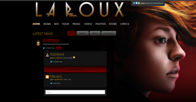
The La Roux website is very simplistic and conforms to the typical conventions of a website using the typical heading to navigate the page. There is also a twitter feed included in the page, making the audience feel more attached to the band and also giving more and the latest information to the viewer.

This website shows only the information that is needed to interest and keep the audiences attention meaning people aren't intimidated by large blocks of text. There is also a large picture of the lead singer in the top right corner this is a rare and strange occurrence as La Roux is actually a band not a solo artist but this is a recurring theme throughout all La Roux's texts. The colour scheme however is very sophisticated with black and red, and it is very appealing. It also gives off a sense of mystery of the band which makes the band more appealing.

On the front there is a pop up music video giving the audience the option to get a preview of the bands music before the research any further, as well as the typical link it gives a link to 'Biography' this is odd but it could be a selling point as people might want to learn more about the band and its history, it is also a clear place to access all the information. This mainly appeal to new La Roux fans or people who have stumbled onto the site, to give them the information needed. This site does appeal to people who are not yet fans.

The social networking aspect of the site appeals and connects to the audiences greatly as they can comment on the bands comments etc. this also make the site more interactive and interesting.

Taylor Swift:

Taylor Swift is an example of an artist who uses her homepage to promote a new album or single. This is a way of keeping her fans up to date with new releases and what she's doing, her also uses a lot of direct adress to her fans, this teamed with the promote encorages fans to buy the album or single because she's looking at you and 'knows' your there supporting her.

Taylor Swift's target audience is mainly females aged between 14-25, this is clear on her home page are there is no nudeity or anything explict. In contrast to Rhianna on the Digipak blog post Taylor Swift is also very desiable but in a 'girl nest door' sense in steady of a sexual object like Rhianna this is convayed by colours. Taylor Swift also comes across as more realistic and accessible as a person this is show on her background on her homepage, which is grass, most people see grass everyday and by having it on her homepage makes her relateable.

By having a 'My Life' page means that the audience is more related to her and makes less of a celebrity and more of a friend. The colour scheme in the picture makes her seem angelic, god like and special. The website appeals to 14 year old girls because it looks quite romantic.


What Are Band / Artist Websites...

Most people use the internet these days, therefore a band / artist website may be a great source of advertising. It is a way bands can get in contact with their fans instantly and help to promote a new album, tour dates and latest news. Websites usually don't cost much and are definitely a cheaper alternative to magazine pages or TV adverts. However the website needs to have an eye-catching design to attract as many views as possible.

They typically consist of these conventions:

· News
· Tours
· Band
· Media
· Store
· Forum
Websites have to have a usability and viewer friendliness so they can be clearly navigated. There are often subheading to break the website up to allow this. Website's could also show audio and interactive activity to capture the audiences imagination and attention to make the site, and thus the band, stand out. The website should also give and idea of genre and ideologies through images and font. You also need to ensure that the website will appeal to the target audience but you also want to captures others attention too.

What Are Digipak Advertisments?

Digipaks adverts are often shown in magazines or posters, this is so they can target their audience in the best way possible, sometimes you see adverts used over Web 2.0 and new media too.

Codes and Conventions of Digipak Advertisments are:
  • Band / Artist Image / Album Cover
  • Band / Artist Name
  • Release Date
  • Band / Artist Website
  • Record Label
  • Copyright Information
  • Where it's Distributed
  • There are also some review to pursuade views that it is good enough to buy.

Analysis of Digipaks...


This is Jack Johnson's 4 panel Digipak - In Between Dramas. This album has a very distinct and recognisable style, even if you'd never listen to the artist before you'd be able to denote that the music is of an acoustic, folk genre. These hints are given to us through the acoustic guitar featuring on the front cover and also the silhouette of the tree on the main panel. 
There is a obvious colour scheme of a bright yellow, black and white. The colour scheme is very important on this album as it is what captures the audiences attention. The connotations of bright yellow that apply to this cover are ideologies of happiness, it is also said that yellow enhances concentration and can strengthen self confidence and encourages optimism, this is a good colour to use in this case as it reflects the album and songs of the artist. As the contrast between black and white gives a balance and mellow feel to the album giving off the idea that it is the type of album that will chill you out and that you can relax to.
 In the silhouette we see Jack Johnson, we know it is him because we can see a guitar in the outline and he has already been seen with a guitar on the album. He is picking leaves off the tree, this link with nature relaxes the audience, it is something the audience may do so we can relate to him and feel like he's the same type of person as us. The 'special edition' sticker makes the audience feel as if they have exclusive access to more material, making them feel like they have more exclusivity than with a normal CD. 
On one of the panels there is a simple picture of Jack Johnson with a guitar, it is mostly unedited, this is used to give the audience the source of most of his music, it is typical to have a guitar featuring in a folk or acoustic album. The guitar takes up most of the panel this is to show the importance of it in the music it is also a view that the target audience would hold.
There is a callout on the front panel is also typical often highlighting the best, most famous songs on the CD to encourage people to buy it. A typical convention this hold is naming the tracks on the back of the cover. The font is bold, and sans serif suggesting connotations of casual and informal making the audience feel like it is more personal to them. The digipak contains all the typical conventions for example the copyright information, artist name, album title, barcode and music label information.

Rihanna's Album 'Loud' contrasts greatly with that of Jack Johnson's this is mainly down to the type of music and target audience which makes the ideologies and visual meanings different.

The main focus of the album is Rihanna, she features on all the panels this is because she is her own selling point, she is a star focus. The close up radiates confidence and is very typical in R&B and pop albums in addition to this is the colour scheme that is used, it is mostly different shades of red, making the album very catching and also suggesting passion and danger, making her very desirable causing people to by the album think the same may apply if they own it.

On the back cover she is looking away again, it is also a long shot, so we can see the whole of her body this gives connotations of two possibilities, the first is that she is teasing the audience, it is quite flirtatious, the second is that she looks quite vulnerable, needy and lonely appealing to the audiences sympathetic side.

On the inside of the panels we see the artist looking at us for the first time making the album feel more personal to the audience, the artist is also lead on red roses giving of romantic ideas.

The colour scheme is probably the most important thing in an R&B / Pop album like this because not only does it convey genre but it also tells the audience the attitude on the audience, we can tell that the songs are going to be energetic and bouncy like the colours used.
This digipak uses all the typical conventions for example album name, artist name, call out, barcode etc.

The layout, colours and camera movement are all used to sell the CD, they are usually used to relate to the audience, to make them feel if the buy this CD the will be part of group.

Tuesday 9 October 2012

Digipak Advertisment Analysis...

I have done some research into Digipak adverts and concluded what makes a good and bad advertisment.
Even though this is a proffesional magazine advertisment I personally think it looks a big studentish - the simple colour scheme: yellow, white and black makes it look bland and quite ametur this is my least favorite poster. How ever I am not the target audience of this poster, the target audience seems to be young males, in their teens and young 20's with a low/medium disposable imcome due probably only having a part time job and beign a student.
In contrast the La Roux poster is much more classy and looks as if a lot of time and effort has been put into planning and creating it, the target audience would be young proffesionals with a high disposable income, due to having a high paying career and a high disposable income as they have no dependants. This poster is much more sophisticated due to a more advanced colour scheme as it use many more shades where as the other is just on shade. I also like the font that is used it convays the personality of the artist very well, it shows that they are young. The profile shot of the women is very intersting and as there is no direct adress use it gives of a cool but mysterious vibe hooking the reader and probably leading on to the buying the CD.


The advert for Gwen Stefani is much more mainstream and pop culture - this advert is designed to appeal to a large audience from families, to teens to people in there 30's. The colour scheme is very bright and playful, its an advert that puts yo0u in a better mood than you were in previously, the yellow and pink clash the creater as chosen two shades that clash well and unsickly, the clashing makes the advert, and the artist in turn, look quirky. The font is Serif and gives of a gothic feel making the advert different - perhaps hinting that there is some indie espects to the singer.


If I end up doing brief 1, the music video I plan to take my insparation from the 'La Roux' advert. As I think it is the most appealing and successful advert and is quite similar to the genre I would chose to do.

What are Digipacks...

Digipacks are a type of CD packaging made out of card stock or other heavy paper/cardboard material. Digipacks can flip open like a book, or it can have three parts, so that one portion of the packaging opens to the right and one to the left, with the CD in the center portion. Usually, the portion of the digipack that hold the CD is made of plastic like a traditional jewel case CD - the plastic part is simply attached to the paper background. The Digipacks are also for DVDs.


Digipacks have pros and cons:
  • They look nice, and many bands and labels like to use them for aesthetic reasons. The three section digipack sleeves opens up more design options because there is more room. However, they're more expensive than traditional liner notes and jewel cases.

  • Digipacks don't crack like jewel cases do, but they will rip and eventually the paper begins to peel apart and separate.

  • The trays in digipacks break much more often then in jewel cases. There's not as much protection since the outer portion of made of paper, so the teeth that hold the CD in place crack and fall out easily.

  • When the teeth of the tray does break in a digipack, the CD falls out of the bottom of the digipack, because unlike jewel cases, there is nothing to hold it in.

  • Digipacks can be more environmentally friendly than jewel cases because they can be made of recycled paper - however, they aren't always in fact made in this way.

Digipaks:

Tend to consist of:
  • Band name / Album Cover - linked to themes and ideologies of the band/album.
  • Trank List
  • Logo
  • Biography of the Band
  • Details of website
  • CDs
  • Copyright information
  • Parental Advisorty (if applicable)
This is a flat plan of a typical digipak:

Analysis Of Music Videos...

As my main task for A2 I am currently researching creating a music video or a short film. These are some video's I have found and enjoyed watching. Some of them are profesional and some are made by students including A Level and graduates.


I like this video as the university students who made it weren't overly ambitious with what they we're capable of - the video is mostly performance with a little story - the simple nature of this make it more effective and intresting to watch. They have also used a good variety of of shots my favorite part was the tracking shot in the desert my only critisism is that the performance shot of the lead vocalist is boring because it is the same thing and very repetative.


This video was created by a profesional music video company in 2011, as well as using what I should imagine is the program Dragonframe to capture painting Gotye and Kimbra it also uses life action, I like the combonation of live action and animation and I hope that I will be able to use it in what I decide to do. However I think that it get boring after two minutes because it is very repetative and there is not a lot going on.


I first watched this video about two years ago and I think it is brilliant. The thing I love about it most is how it is beautifully shot, personally I think this video is better than the offical video with Taylor Swift. this video has clearly been well thought through, I don't often enjoy watching music videos but I really enjoyed watching this one, I hope that the music video we create is shot as beautifully as this. I also like profile shots like the thumb nail as they are creative and different.

Making a Music Video...


This is a powerpoint I made to give instructions on how to make a music video.

Codes and Conventions of Music Videos...


This is a powerpoint I created in codes and conventions of Music Videos.

Tuesday 2 October 2012

What Are Music Videos...

A music video or song video is a short film integrating a song and imagery, produced for promotional or artistic purposes. Modern music videos are primarily made and used as a marketing device intended to promote the sale of music recordings. Although the origins of music videos date back much further, they came into prominence in the 1980s, when MTV based their format around the medium. Prior to the 1980s, these works were described by various terms including "illustrated song", "filmed insert", "promotional (promo) film", "promotional clip" or "film clip".
 Music videos use a wide range of styles of film making techniques, including animation, live action filming, documentaries, and non-narrative approaches such as abstract film. Some music videos blend different styles, such as animation and live action. Many music videos do not interpret images from the song's lyrics, making it less literal than expected. Other music videos may be without a set concept, being merely a filmed version of the song's live performance.
Music videos can be made for multimillion artist and songs with many special effects or indie bands just starting out. Music videos are accesible and can be made by virtually anyone.

Final Task...

We are now starting to research our final task, I am researching into music videos and short films as these are the briefs that intrest me.

Other Shorts...

These are four shorts I have made outside of school. These are the standard in which I would like my final task to be.

The Olympic Village:

The Olympic Village from Jessica Milverton on Vimeo.

A Vitrtual Obsession:

A Virtual Obsession from Suited and Booted Studios on Vimeo.

The Seeing Thought:

118478909 from Jessica Milverton on Vimeo.

The Broken Circle:

The Broken Circle from Jessica Milverton on Vimeo.

The Suspect...


This is our finished video we have done for our preliminary task. My favorite thing about this video is the dull, film noir style lighting, it really helps to capture the mood of the interview. My main critisism of the video is that is doesn't relate much to the script, for example the costume and props aren't the same as in the script. In addition the title sequence is not very profesional, this then has a negative efect of the video and makes it feel more like a student video than a profesional standard video. From this I have learnt that it is vital that not only the crew but the cast also sees the storyboard and the script. If I were to do this again I would alsoo use a larger varitey of shot types and framing.

Locations of Filming...

These are the locations that we filmed our preliminary task in.