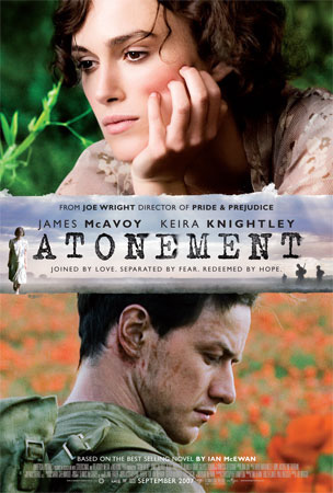
This poster contains all the typical conventions of a film poster; it also contains some extra information like 'Best selling novel' and 'director of Pride and Prejudice'.
In both images the background is not in focus meaning that the characters are the main focus suggesting the theme of romance and drama. It also makes the two characters stand out more this could reflect their importance in the film. The two main characters are looking in different directions suggesting that they are worlds apart or don't get along, however this contradicts other readings of the poster.
The female in the poster is wearing high class clothes suggesting that she is from a high class family she also seems to be dressed the same as the women in the banner meaning it could be her or someone she is related to. This contrast with the male character as he is wearing an army uniform and you can visible see that he is dirty and you can see wounds or scars we can tell that he is a solider and maybe not from that high a class family, this leads us to think that this is what has been keeping them apart. Our ideas about the man being a solider are confirmed in the banner as we can see men dressed as solider holding guns. This makes the audience think that he is going to be the traditional hero.
In this image there is no background shown this could be because the characters are the main focus and they don't want to attention to be drawn away from the 'monsters'. They have also used the logo or a previously very successful film to attract the previous audience of that film; they use it as a star appeal like Keira Knightly in the last poster.
No directors are mention this is because I is a child’s film and they aren't interested who directed it. However the film companies are mention this is because they have strong connotation of producing high quality, entertaining children’s films. The poster has also put in the release date so people know when to see it. The title is also very bright and bold as to attract a child’s attention and for it to memorable, this is why they have put an eye into the M also it makes the audience know that it is a light hearted film.
The characters are very detailed, for example we can see separate strands of fur this tells that audience that the animation is very high quality and modern. Both the characters are smiling so you know that it a child’s film and that it is happy making you want to take your children to watch it, the animation doesn't look childish either suggesting that adults may enjoy it too. The bigger character it wearing a smug smile this suggests that the film will be humorous.
This poster uses most of the typical conventions it states who the film is directed by, so the audience of his previous work would watch it because they enjoyed his last work. They also insert a website where you can find out more about the film, and in turn the audience may be lured into watching the film after they see the website. The have also put in some 'small print' information into the poster and also the production and film companies are listed as you may know what the typical like and this may draw you in.
The font of the title and the tagline is quite gothic and mythical and this suggests what the film is about, serif font is often associated with creature and mythical characters like vampires. The use of capitals throughout the title makes it look very bold and it instantly gets your attention also by it being it in the centre means that it immediately attracts your attention. They have also used special effects of the blood behind the title to leave an impression this also brings connotations of death and evil, it is typical convention of a horror. This is also reflected in the background it is quite dark and it also looks foggy suggesting mystery.
There is a close up in the poster of both the main actors this makes us feel more part of the action. The girls eyes have been edited a different colour and there is blood on her lips so we know she is the vampire, she looks very creepy, possed and scary. The boy juxtaposes her as he looks innocent and venerable it looks like the contrast of good vs. evil. However they are clearly embracing, this tells the audience that this is not your typical vampire movie and there is a depth in the story.


No comments:
Post a Comment