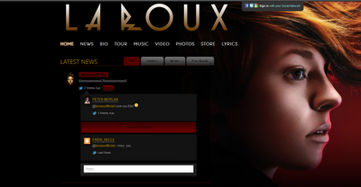
The La Roux website is very simplistic and conforms to the typical conventions of a website using the typical heading to navigate the page. There is also a twitter feed included in the page, making the audience feel more attached to the band and also giving more and the latest information to the viewer.
This website shows only the information that is needed to interest and keep the audiences attention meaning people aren't intimidated by large blocks of text. There is also a large picture of the lead singer in the top right corner this is a rare and strange occurrence as La Roux is actually a band not a solo artist but this is a recurring theme throughout all La Roux's texts. The colour scheme however is very sophisticated with black and red, and it is very appealing. It also gives off a sense of mystery of the band which makes the band more appealing.
On the front there is a pop up music video giving the audience the option to get a preview of the bands music before the research any further, as well as the typical link it gives a link to 'Biography' this is odd but it could be a selling point as people might want to learn more about the band and its history, it is also a clear place to access all the information. This mainly appeal to new La Roux fans or people who have stumbled onto the site, to give them the information needed. This site does appeal to people who are not yet fans.
The social networking aspect of the site appeals and connects to the audiences greatly as they can comment on the bands comments etc. this also make the site more interactive and interesting.
Taylor Swift:

Taylor Swift is an example of an artist who uses her homepage to promote a new album or single. This is a way of keeping her fans up to date with new releases and what she's doing, her also uses a lot of direct adress to her fans, this teamed with the promote encorages fans to buy the album or single because she's looking at you and 'knows' your there supporting her.
Taylor Swift's target audience is mainly females aged between 14-25, this is clear on her home page are there is no nudeity or anything explict. In contrast to Rhianna on the Digipak blog post Taylor Swift is also very desiable but in a 'girl nest door' sense in steady of a sexual object like Rhianna this is convayed by colours. Taylor Swift also comes across as more realistic and accessible as a person this is show on her background on her homepage, which is grass, most people see grass everyday and by having it on her homepage makes her relateable.
By having a 'My Life' page means that the audience is more related to her and makes less of a celebrity and more of a friend. The colour scheme in the picture makes her seem angelic, god like and special. The website appeals to 14 year old girls because it looks quite romantic.


No comments:
Post a Comment